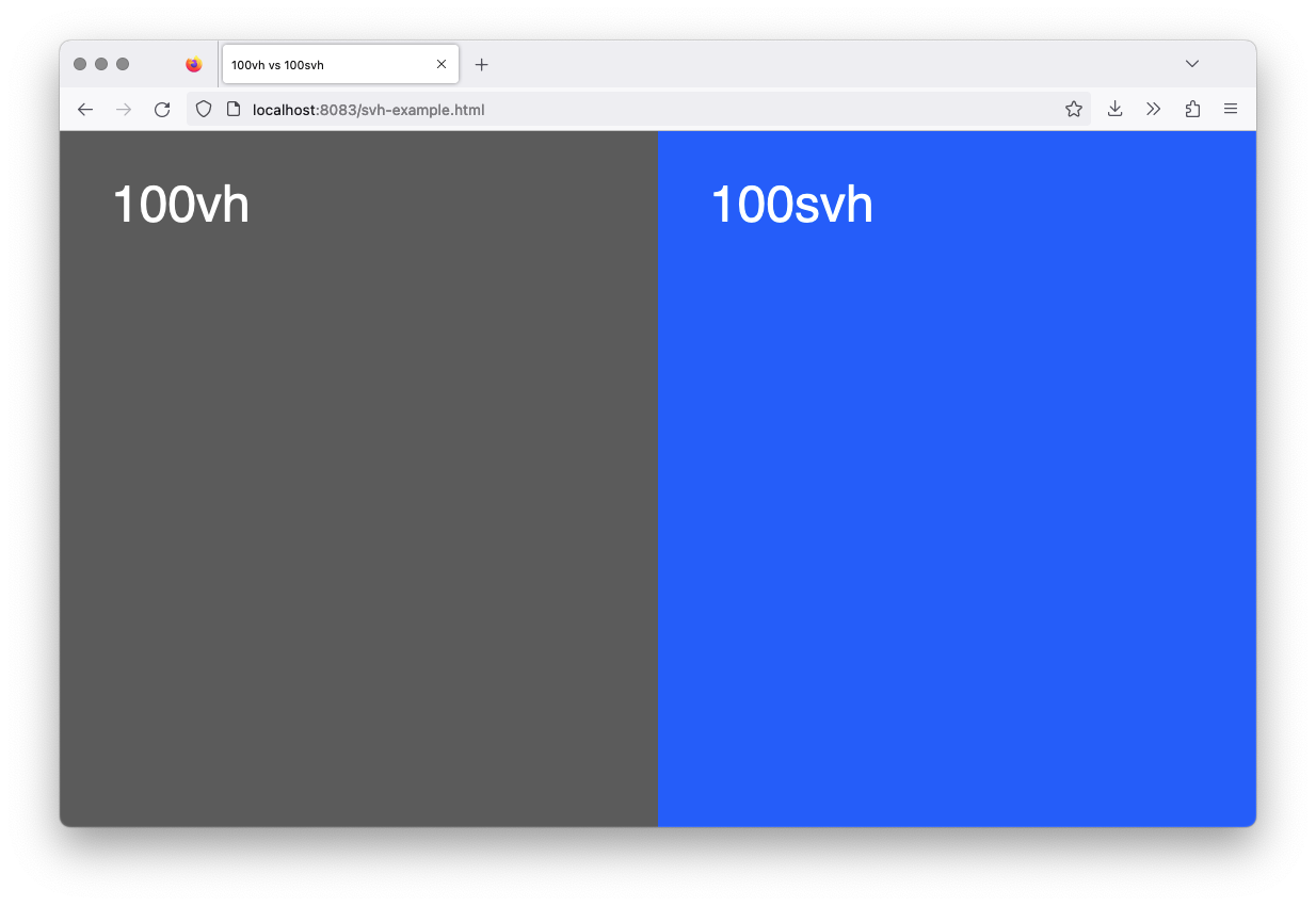
I recently became aware of a CSS feature that makes developing websites for mobile devices much easier for me:
The svh size unit works very similarly to the vh unit and gives the ability to set the size of an element in relation to the size of the browser window.
For example, an element with a style rule of height: 100vh is the same height as the browser window. The style rule height: 100svh works in the same way, and produces the same result in desktop browsers.

In the desktop browser, both elements are displayed at the same height, a scroll bar is not visible.
It gets really interesting when you look at the result on mobile browsers: The available area is calculated differently here: Since the user interfaces of mobile browsers can sometimes have dynamic elements that can disappear (when scrolling, for example), there is a difference between height: 100vh and height: 100svh:
For the calculation of height: 100vh, areas that are covered by the browser interface are counted, whereas for elements with the height specification of height: 100svh, only the non-covered or visible areas are counted.
On mobile devices, elements with a style of height: 100vh cause a scrollbar to be displayed whereas no scrollbar is for elements with height: 100svh.
In the iOS browser, a scroll bar appears when height: 100vh is specified; the element with height: 100svh is as tall as expected.
You can also try the demo for youself.
According to the website Can I Use, svh (as well as other units such as svw) is supported in all common browsers.